Colour forecasters are an interesting breed. They're like meteorologists, but their predictions somehow become factual more often than not.
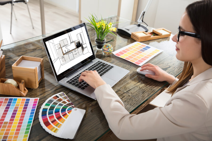
Professional kitchen designers have a tough decision to make when considering colour palettes for clients: is it considered a best practice to always follow the trends and promote the most modern style, or is it best to consult time-tested aesthetics supported by the ultimate custom colour palette?
We wanted to know how colours psychologically influence the energy and aesthetic of a kitchen design, and how to use knowledge of colour, aesthetics, and kitchen design to come up with the ultimate kitchen colour palette for a custom culinary space.
The Problem with Colour Trends
The trouble with any trend, is that their existence is often crafted with the help or influence of many parties that ultimately benefit from the news.
Think fashion, culture, and news - but also colours used in various interior designs. In short, colour trends can be bought and sold. In this sense, we believe it’s best to always formulate kitchen colour palettes by working directly with our clients and offering feedback and resources to help them make the best possible choice for their personal character and lifestyle.
Are colour trends a bad thing? Absolutely not! The key to working with your clients as designers is giving them the opportunity to express themselves in a way that supports a feeling of success and excitement. If a client really enjoys the newest colour palette trend of 2018 for their new kitchen space, so be it! Professional and reputable designers always make it their business to empower the dreams of their clients. Period.
The Pantone Color Institute releases its ‘colour of the year’ annually, and this year it’s Ultra Violet - a complex, bold hue that’s inspired by “the mysteries of the cosmos, the intrigue of what lies ahead, and the discoveries beyond where we are now.”
The very unique concept behind this annual design and colour trend is a dedication to reflecting back on the state of the world - it proudly goes beyond the virality of popular pins and home decor blog trend forecasts by integrating aspects of society and awareness to help inspire and dictate what a trend should be, rather than by following what the popular kids are doing.
Bold Colours
Big bold colours are powerful tools in the arsenal of a kitchen designer. Colour can effortlessly create drama, and even feelings of tranquility, aggression, and revitalization. The key to utilizing bold colours can be summed up by investigating colour theory and understanding what the psychological implications of each hue do to the human eye and mind. Each colour brings forward certain emotional responses and psychological expectations from their presence. Let’s look at a few popular bold colour choices and investigate what they mean to the mind:
- Big powerful blues for example, is defined in formal colour theory as the hue of intellectualism. It’s a soothing, reassuring tone that affects us mentally, as opposed to physically - like red can sometimes do. It’s a colour that denotes clear communication, efficiency, and reflection.
- Orange, on the other hand, is associated specifically with food. It’s a warm, nurturing, passionate colour that is often focused around sensuality and fun. As a negative, orange can also psychologically conjure up emotions of deprivation and impracticality.
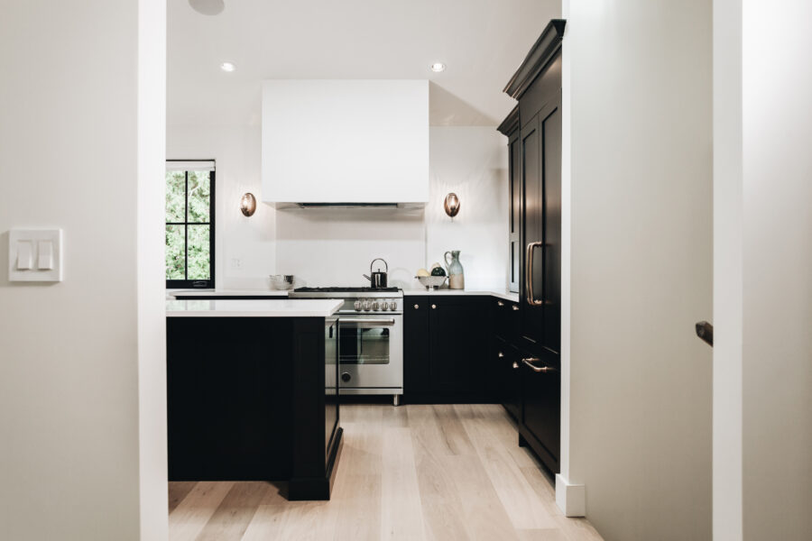
- Black is an interesting one - once associated with the macabre and a dark, ominous vibe, black has evolved over time to represent a sophisticated glamour steeped in a substantiated character and big time personality. Psychologically, black communicates a unique, all-encompassing clarity and elegance.
- White is a staple of modern kitchen designs, and has been for decades. Why? Because psychologically it's always been associated with sterility, cleanliness, hygiene, sophistication, and simplicity — all perfect adjectives to describe a dream kitchen. White also helps increase the perceived size of a space. Coupled with black, the lightness and clarity of white can also bring about a deep, powerful juxtaposition, helping enrich the heaviness of black and emphasize the purity of the white.
Neutrals
While bold colours may be the going trend in creating the ultimate kitchen colour palette, well-placed and thoughtful neutrals are timeless and never go out of style. Everyone knows about the real estate resale beige that is supposed to place all homes on a level, somewhat pleasing playing field - somewhere in between too bold, and too drab to really offend or wow an observer.
However, neutrals are fantastic options for a kitchen colour palette if you put in the extra effort to creatively assess your space, your lifestyle, and carefully insert neutrals into your design plans.
Neutrals are key pillars of creating a strong foundation for more innovative and strong colours and features. They also lend themselves well to playing a solid background role, not competing for attention or stealing the limelight from a kitchen overhaul or renovation. Neutrals are often warm too, piggybacking off the psychological merit of brown and red hues, helping warm up the sometimes clinically cold, classic white kitchen.
For 2018, gray-beige tones are key to refreshing and updating use of classic neutrals in the kitchen. They not only help showcase a powerful accent wall of colour (we suggest pairing a deep blue, or even with brass/copper fixtures), but they can also be subtly adapted to help usher in a new feeling. For example, adding a slight green tint to a grey-beige paint will develop a sage that can usher in tranquil and soothing emotions that ride the wave of green’s tendency to revitalize and provide an energetic zest to a room.
Finally, neutrals are adaptable in that they don’t have to play backup for anything. Accenting a neutral kitchen space with light countertops and a subtle backsplash can help accent the presence of neutral colours, helping boost the appeal of the room and integrate features - rather than differentiate. Sometimes it’s critical to be able to fit in, demonstrating that balance is a true art form unto itself.
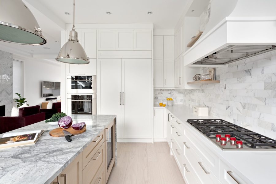
Crisp Whites
Just when you thought we had jumped ship from the classic white kitchen in favour of juicy colours and subtle neutrals; there are a plethora of ways to use the timelessness of white in your kitchen in new and modern ways for a fresh and inspired kitchen colour palette. First things first, white reflects light, and reflected light can draw attention to tiny details, material quality, imperfections, and stains from actually using your kitchen (which you should!) The key to using and loving the white kitchen is finding ways to help white elevate and draw attention to high quality attributes.
This can mean showcasing the stunning stainless steel appliances, stone accents, brass faucets and lighting fixtures, colourful art, and even hardwood architectural elements like beams, pillars, and/or flooring. The inclusion of crisp white walls and stone or tile backsplashes can help the accentuated natural and metallic finishes bring an authentic warmth and character into the room, also drawing the eye away from the powerful reflection ability of a predominantly white colour palette.
White is a great companion for natural light, and having the availability of natural light helps white kitchens feel fresh, open, airy and inclusive. With natural light also comes views of nature, and white kitchens can utilize this feature beautifully - because the white acts as a blank canvas to showcase the textures and colours of the outdoors, bringing them inside. In this sense, white is also a capable mediator between bold and powerful colours. Use white to help balance blacks, reds, blues - and elevate the eye away from the darkness and towards the relationship that light and dark share.
![]()
Paint Maintenance
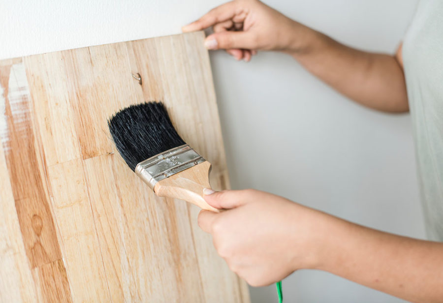
Paint is not impermeable to damage. Like any other surface in the house, it can collect dust, stains, cracks, and chips. And therefore, like all surfaces, it requires some maintenance.
General maintenance will likely mean warm water and a bit of dish soap to remove all the standard stains, spills, and other cleaning jobs you’ll encounter. If at all possible, refrain from using harsh detergents on your walls.
The time-tested aesthetics of your dream kitchen are as individual as your smile — no one trend or prescribed colour palette is the answer for a vast number of discerning homeowners. Individual style and personality can only shine through when you dedicate yourself to investigating who you are, and what type of space you want to entertain family and friends in - and spend in yourself. Whatever your style, it’s always inspiring to consult the trending colours of the day through any number of platforms and mediums, like Pinterest and home decor magazines, for example - but at the end of the day, we want to encourage all our readers to dive deep within themselves to make sure they’re painting and decorating their dream kitchens with what they want - not what trends dictate.